On Sunday evening, March 18,the two inner planets and the slender Young Moon will make a sparkling line just above the western horizon.

Venus will be closest to Mercury (3.8°, or about the width of four of your fingers at arm’s length) at 8 Universal Time, which is 5 hours earlier by clocks in eastern North America, 8 hours earlier – midnight – on the west coast.
What is happening in space is this:

Mercury, as seen from Earth, was at its greatest angular distance from the Sun (“elongation”) on March 15, at 15 UT. That elongation reached 18.4°. Venus, in the background, keeps progressing out into the evening sky, to reach its greatest elongation of nearly 46° on August 17.
Meanwhile the Moon, from its New moment on March 17 at 13 UT, springs out in front of the planets. It passes closest south of them around 22 UT on March 18 – which is from 2 to 7 PM in the contiguous US. So at the picture time it has just passed them, but will still be not far from a straight line with them. But, a day and a half old, it will be very slim: exciting to see, if it can be seen”
Mercury at this stage shines at magnitude 0.5, like the almost-brightest stars. Venus at magnitude -3.9 is nearly 60 times brighter, though it will wax far brighter still toward August.
Now –
You’ve heard of crowdfunding. Here is a chance to help me by contributing not funds but wisdom.
I’ve prepared almost all the text and illustrations for my book to be called A Longer View of Uranus, Neptune, and Pluto. But there is a suggestion that I’m using too large (childish?) a typeface. It looks okay to my eyes, but that could be because of my eyes. Changing the size of type is a scary decision, because it makes everything “reflow.”
Attached are four versions of a page. One, in what I’m using: Arial, 12 point. (Arial, which I formerly despised for its plainness, has become the default font on the Web, and I now have to confess I find it the most readable.)
Two, Arial 11 point.
Three. Optimum 11-point. I used Optimum for my sciency things, such as the Astronomical Calendar. I thought it more pleasing than Arial, because it has thick-and-thin. But I now find it much less readable, at any rate on the monitor.
Four, ITC New Baskerville 11 point, a serif font. I used it for literature, such as my Troy Town Tale, after finding it was the closest I could get to a book I once picked up whose pages were so pleasing that I stroked them. Now I’m not so sure.
II’m hoping that you can download these four versions and give me your advice. It’s rather fun: you can open these PDF pages and they sort of sit on top of each other for comparison. You may feel you can see them well enough on your monitor, but that may be deceptive because of magnification; it will be better to print them out, if you can.
Choosing page 22, which is part of “The Story” (of the planets’ discovery), has a side-advantage. You will notice in the caption at the bottom that “I would have liked to include the 2006-2015 trajectory of New Horizons to Pluto, but have not been able to persuade the authorities to give me usable orbital elements for it.” Perhaps you have a connection into NASA or the Southwest Research Institute or the Johns Hopkins University Applied Physics Lab and could find a member of Dr. Alan Stern’s team willing to give me those classical orbital elements.
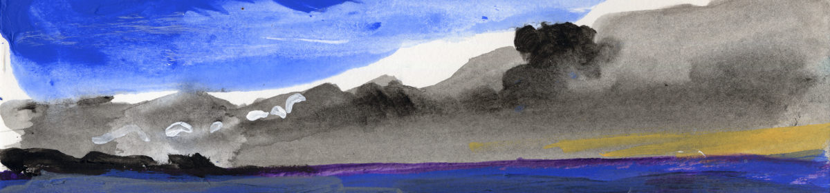
On the subject of planet-crowding, although I don’t think that Guy has posted anything recently about the nice planet parade in the morning sky, it’s well worth getting up early and finding a good southern horizon to see Jupiter, Mars, and Saturn strung out along the ecliptic like beads with Spica and Antares. All three are to come to opposition this spring and summer. In particular, if my planetarium software is accurate, Mars will be larger than 24″ across for 17 nights from July 23 through August 8. This was the view from my driveway this morning, March 24:
https://www.flickr.com/photos/starvergnuegen/27113580648/in/dateposted-public/
Mars and Saturn among the star clouds of Sagittarius
I’m a little late with this comment, but the other evening, Sunday March 18, we had crystal clear skies in the evening for the exact scene you depicted in the chart (I’m in central Virginia). Beautiful view of the Moon, Venus and Mercury lined up exactly like Orion’s belt, with Mercury slightly above the position it would have had if the line was perfectly straight. I wonder how often you see three solar system bodies lined up so nicely, at almost exactly a 90 degree angle to the ecliptic!
Thanks for the celestial-body heads-up. We arrived in Barbados on March 17, and the next day took a walk down to the beach at about 6:30 p.m. (so about 10:30 UT). We stay on the calm west coast, so had a clear view over the ocean to Venus, already bright in an orange-colored sky. Because your information on where to look was so precise, we stared at a faint fuzzy line over to the left until it resolved itself into a very, very thin lunar smile. When we left the beach 20 minutes later, we still hadn’t discerned Mercury. but after we crossed the road on the way home, took one last look back at Venus, and saw a very faint twinkle off to the right, just where it was supposed to be. A lovely evening, all thanks to you. My husband calculated that it was approximately a 33-hour-old moon.
Marcia L. Barr
Definitely ITC New Baskerville 11pt.
I printed and gave to my wife who is older than me (I’m 55). She much preferred the Arial fonts for legibility – especially the 12.
On screen I picked the Baskerville and aesthetically it looks best on page to me but for readability over many pages the Arial 12 would be easier on my eyes. I think this is purely a font size issue.
We both wear glasses and have dedicated reading glasses.
The ITC New Baskerville looks the best to me, although on the screen (no way to print it out for comparison that way) it is on the edge of being too small at 52 years of age and bifocals. It also “feels” more like the type from the Astronomical Calendar than the Arial fonts.
I could not print them out because of where I’m viewing them, but on screen I prefer the Arial 11. I also noticed one typo: “Voyager 2 launched 1977 (a few days before Voyager 2)” ~ of course you meant “(a few days before Voyager 1)” I think Optimum 11 has one advantage in that, to readers of your Astronomical Calendar, it would look like an Ottewell astronomical publication.
3 or 4
I take a different approach: if it’s going to be a book by Guy Ottewell on astronomy things, I would expect the same appearance as the other books I have on my shelf (not just The Astronomical Calendar but others, too). Also, because the type for the illustrations has been already set–and indeed in line with previous books and this very weblog–I favour Optimum 11-point.
Without printing them and only viewing on an iPad Pro, and being a many years fan of Astronomical Calendar, I prefer the NewBaskerville11. It makes me feel the best.
I think 12 font is ideal. Maybe your critic was befuddled by the content so he feels superior by criticizing the font as being childish.
The youngest moon I ever saw was on 4/25/90. I calculated it to be 20.4 hours old. You listed it as being 19.4 hours old at sunset at 75 degrees longitude. I added a half hour because I saw it at Longitude 82 degrees longitude, about half a time zone west of 75 degrees longitude. I added another half hour to its age because I didn’t see it until half an hour after sunset.
Since i witnessed a 20 hour old young moon, a 36 hour old young moon should be easy to see. Of course, I’ll need to be under a mountain of air (high pressure / clear skies).
PS Noticed a typo error in paragraph 2: FLorida
Glad you let us help you decide! . I too printed all of them out. Definitely NO Arial 12. Optimum is too old fashioned, we’ve been there and we’ve done that many years ago! Baskerville reads well and so does Arial 11. Have you thought of Arial 10 pt!? Give it a look.
Heide, so good to hear from you! And from the professional side of printing, as some others are. I’ll be weighing all this wonderful feedbacj and forming a general response.
Arial 12 point suits these 63 year old eyes and their floaters best.
It’s an interesting problem. For some reason, sans-serif fonts seem to read easier on-screen, but serif ones read better in printout, certainly for me.
On screen, I find the caption font (presumably Optimum 9 or 10-point) by far the easiest of any to read – plus it’s handy having that available as a direct comparison on each of the four PDF examples.
In printout, the New Baskerville has a slight edge, though the Optimum (both 11-point and caption-size) works pretty much as well for me. Both the Arials look a little too “large and clumsy” on printout, however.
I’m honored to reply to an Astro Calendar contributing author!
One of the reasons I like the large/clumsy 12 point is that it makes the words seem to float in front of the diagram. (Kinda like the Star Wars text at the beginning of the film.)
In other words, 12 point text that appears close by enhances the 3-D visualization of the distant solar system.
I did not print out the different fonts. I did open them up in separate windows and flipping between the windows, viewed them in different magnifications. Of course my comments are subjective. However, I spent 8 years doing camera work, paste-up, layout–choosing different fonts, in the printing industry. This was in the 1970s when everything was done by hand.
My picks:
1. Arial 11 point. Clean and bold. Easy to read. Not as cluttered (sentences spaced close together) as Arial 12 point.
2. Optimum 11-point. Not as easy to read as Arial 11 point. A more interesting type with the thick and thin lines and the serif.
3. ITC New Baskerville 11 point. Again, a more interesting font, but not as much spacing between the sentences as Optimum, making it slightly harder to read.
4. Arial 12 point: Spacing of the sentences is closer together, making it harder to read.
Caveat: in the 1970s I did not need glasses nor had internal “floaters” in my eyes.
Yes, Arial 12 looks the best.
Not that you need other suggestions, but I like Verdana because (I think) it gets rid of the 1vs l and O vs 0 problems some fonts have.
But the box won’t let me show an example.
I found Arial 11 point very readable.
The orbital elements can be found here, but you need to change the type from “OBSERVER” to “ELEMENTS” and select the spacecraft. I hope this is helpful!
https://ssd.jpl.nasa.gov/horizons.cgi#top
Oh, and by the way — We had a break in the rain yesterday afternoon and evening. Venus and Mercury were glorious! And once the sky got fully dark, it was very transparent! Even from my urban backyard, Orion’s sword through image-stabilized 10×42 binoculars was stunning, with all those bright young stars twinkling merrily, and lots of nebulosity visible in M42. And the Pleiades! Quite a treat.
I printed them out. Baskerville is my first choice. I find serif fonts much more readable. I also like that the main text is in a serif font and the the figure caption in sans serif. I can tell at a glance which is which. If both main text and captions are in sans serif fonts, sometimes I mistakenly try to read through from text to caption and get muddled.
Among the sans serif fonts, I prefer Arial 11. Arial 12 looks too big on the page. Optimum would look better if the line spacing was a little greater.
P.S. I’m using a black ink printer, so I lost the color of the figure.
I definitely prefer the Optimum 11-point version. Looks much less crowded than using Arial. The second choice would be the serif font, although I prefer it for non-technical literary endeavors.
I printed them all out. I like the serif typeface the best *on paper*. Next, the Optimum 11. The Arial 11 is too “dense”–too high of an ink-to-paper ratio. Likewise, the Arial 12, which is even worse in that regard.
1. ITC New Baskerville 11 point
2. Optimum 11-point
3. Arial 11 point
4. Arial, 12 point