The waxing Moon will appear close to Mars and remote Uranus in the evening sky of Sunday, February 10.

This scene (see the end-note about enlarging) is set for two hours after sunset so as to let the trio of bodies come down lower toward the horizon; this makes the picture more compact. But if you look an hour or so earlier, you will be nearer to the time when the cluster is tightest: 20h Universal Time on Feb. 10. A circle enclosing them reaches at that time its smallest diameter, 5.68°.
The three are widely different. The distance from us to the Moon is about 62.5 Earth-radii; the distances to Mars and Uranus are 1.605 and 20.204 astronomical units (Sun-Earth distances). Their apparent widths in seconds of arc are 300, 5.8, and 3.5. Their brightnesses are -8.5, 1.0, and 5.8, in the magnitude scale in which each step represents a factor of about 2.5 in amount of light. – In other words, the Moon glares even though less than half its sunlit disk is showing; Mars twinkles beside it, and Uranus, though it is like one of the dimmest of naked-eye stars, probably needs binoculars.
The Moon will pass closest to Mars a little more than an hour later, and Uranus 3 hours later again. Then Mars will pass Uranus on Feb. 13.
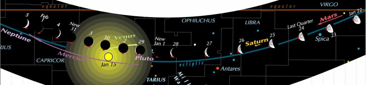
The movements of these three across the background of the constellations appear like this in the February band of our Zodiac Wavy Chart –

– though, to save clutter, the constellation names are shown only in the January and December bands.
The chart (here it is hanging from a clip to allow it to unroll and flatten out) is nice and shiny.

I didn’t get to see this at first, because the experimental copy shipped to me came from the printing company’s plant at Riga in Latvia, where they weren’t equipped to use the top-quality paper. After that, we arranged that copies shipped to anywhere are printed in the U.S. and are strong and shiny.
As for news from our home planet, you may have heard that 2018 was the fourth hottest year on record. The only years hotter were the three previous ones. Does that mean a sudden cooling trend? Deniers are very likely claiming so. Look at NASA’s graph of world average surface temperature, based on massive data from all countries.

There are zags in any such graph. When I started collecting what I could learn about climate change, 1998 was the record hot year and there had been several less hot. Look at 1998 in the graph.
Britain’s Meteorological Office changed its name in 2000 to Met Office, which I think was ill-advised, there being so many other Mets that stand for Metropolitan. Well, the Met Office has issued a warning that the increase to 1.5° C above pre-industrial world average temperature has at least a 10 percent chance of coming within five years, rather than fifty. Look again at the graph and you can see why. 1.5° is now accepted as the threshold we must not cross, if we are to save ourselves and the world’s biota from catastrophic runaway warming.
An interesting twist to climate change is the finding that humans were at least a large part of the cause of a temporary cooling phase – the “Little Ice Age” – by decimating the native population of the Americas, so that much land reverted from agriculture to forest. That was hardly beneficial. But it suggests that replanting trees, and allowing industrial monoculture fields to be replaced by vertical farming in cities, are among the best ways to cool climate change now.
__________
DIAGRAMS in these posts are made with precision but have to be inserted in another format. You may be able to enlarge them on your monitor. One way: right-click, and choose “View image”, then enlarge. Or choose “Copy image”, then put it on your desktop, then open it. On an iPad or phone, use the finger gesture that enlarges (spreading with two fingers, or tapping and dragging with three fingers). I am grateful to know of what methods work for you.
This weblog maintains its right to be about astronomy or anything under the sun.
The dramatic reduction in global average temperatures from 2016 to 2018 correlates directly with Donald Trump becoming President ~ his policies must be working! I was a little surprised that there was no mention of the Maunder sunspot minimum in the Guardian article regarding the Little Ice Age. I always thought that climatologists were fairly certain that deep extended periods of solar maxima or minima correlated very well with global temperatures. It would be interesting to know to what degree the Maunder minimum accounts for the Little Ice Age compared to reforestation due to population decline.
Is shiny better than not shiny? And it looks like temperatures clustered around the 0° deviation until the mid-‘30s, then jumped up around +.2° through the ‘70s. Though the sample is small, it looks like the next cluster is not yet here; and may well be, literally, off of this chart.